KDE 4.13 is powerful as hell. But it is just a generic or classic desktop that awaits for the user to customise it. GNOME on the other hand aims to provide the user with a workspace. A delightful experience!
GNOME is based on the GTK+ toolkit which i believe not to be the on bleeding edge of technology as Qt actually is with it’s innovating QML technology.
GNOME, says to me:
Hi you there, welcome! Let me hold your hand and walk you around. You want to hear some music? You want to start working? Just type in your command and i’ll do it for you 🙂
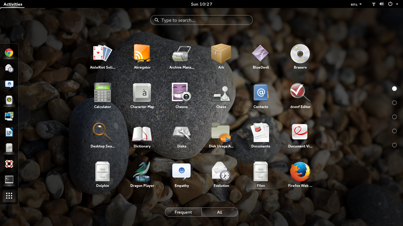
Here’s how the menu or dashboard looks like. Type any program or recently used files here:
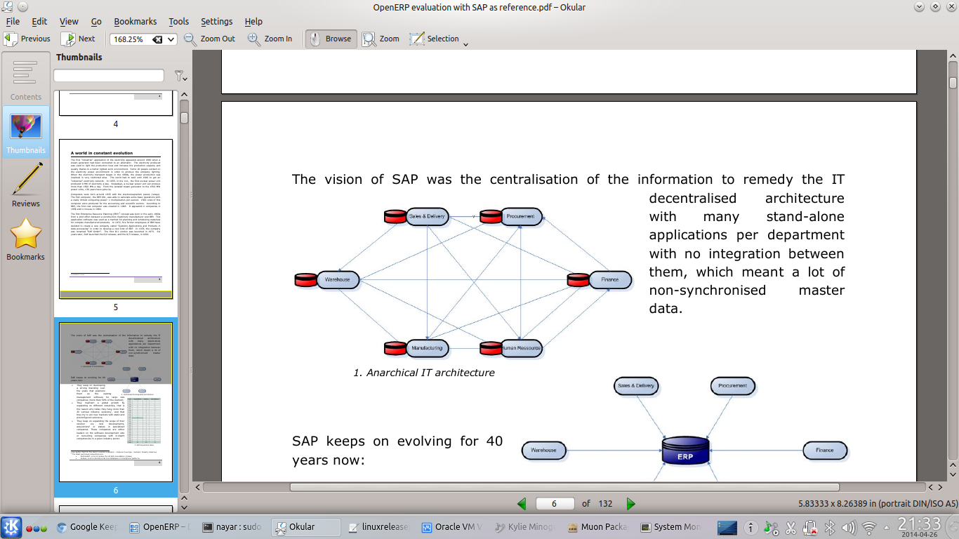
Vertical space is very precious in modern 16/10 screens. GNOME knows that very well. It takes minimal amount of your screen and allows you to focus on what you have to do. Let’s compare reading a PDF in KDE 4.13 and GNOME 3.12
————–
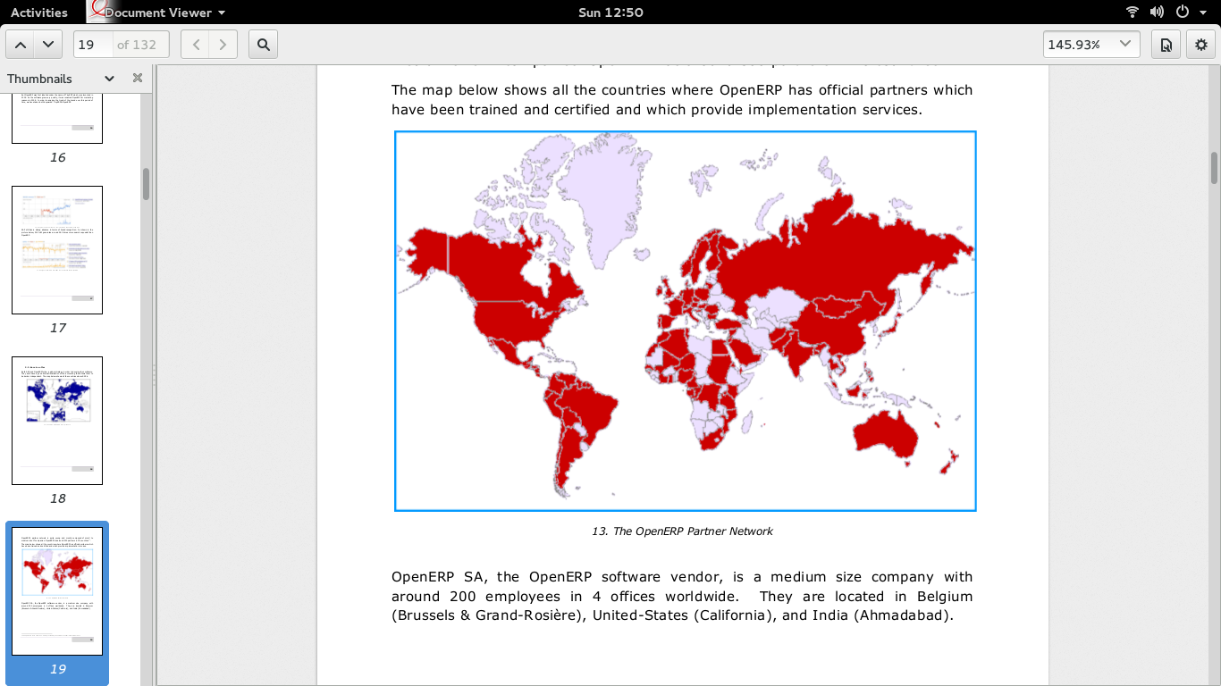
Saw the difference is readable space?
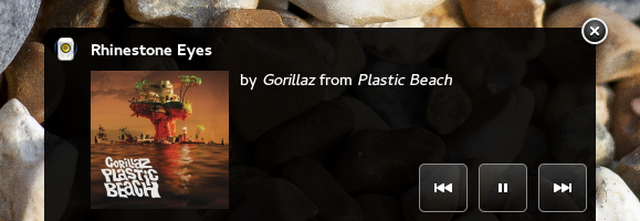
GNOME is dedicated to offer you an experience as stated before. You’re listening to music while working. You press the next button on your keyboard, a non-intrusive notification appears at the bottom of the screen which disappears by itself after few seconds.
If you want to know more about the song, just put your cursor over it, it expands revealing more controls.
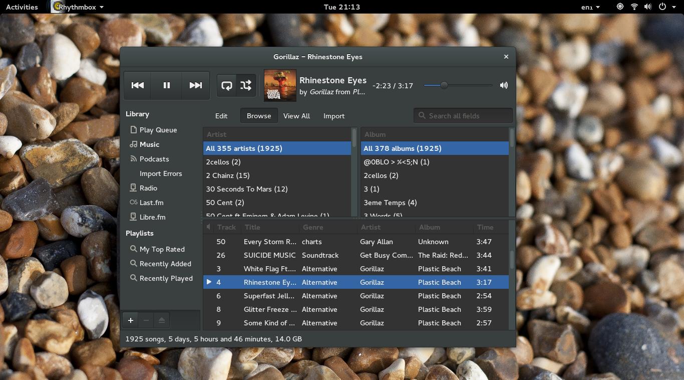
Click on it, the full music app shows up. Genius! Choose the song you want then close it. Continue working as if nothing happened.
Conclusion
Despite KDE apps like Dolphin, Okular and all have much much more feature and are more powerful, using GNOME apps at first seems such a great experience 🙂
In an ideal world,i’d like GNOME to be written with Qt Framework and QML. Or GNOME ‘Human Interaction’ team to take over KDE Plasma and make KDE rule the world. Or just forking existing KDE apps into GNOME. Do try GNOME 3.12 😀
