Don’t know quite well what does KDE Frameworks 5 do except that it is supposed to be much more modular. As an end-user, what wows me is the user interface of KDE. Some call it Plasma 2 and recently some are calling it Plasma 5. IDK. It is supposed to be built using Qt’s latest technology i.e. QML. I’m a great fan of QML BTW.
Plasma 2/5
Looks just like any other KDE (or highly customized Windows XP,7). No new usage paradigm involved.
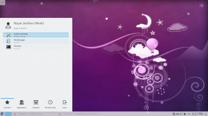
Start-up Menu
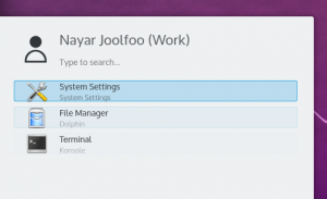
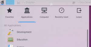
The start-up menu looks much more cleaner. However, there are some padding issues which make is not so beautiful. See in the screeny below.
The Taskbar Panel
There is a nice little blue bar over the active windows’s taskbar item.
When the panel is put on the top edge of the screen, the blue bar disappears
In the start-up menu, it gets broken.
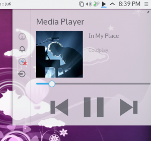
Music Controller
KDE finally got the long awaited music controller widget by default which i used to love in GNome and Unity.
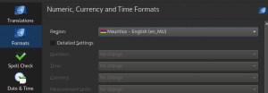
Regional Settings
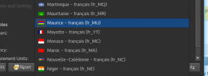
Mauritius is listed as both English and French speaking which is nice
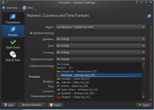
The settings below suck.
How i’m i supposed to know which country uses 24hr time format or centimeters instead of inches? KDE 4 had better visualizations for these.
KRunner on Desktop
When your computer boots, no need to click on the startup icon and choose the programs or file you want to open. Just type in the desktop. KRunner will magically give you the results. 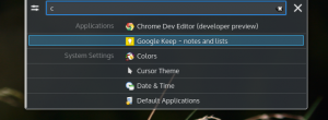 That’s all for now. KDE will be the leading DE in the future. But it does need some UI refinements. After few more releases, it’ll be perfect i guess
