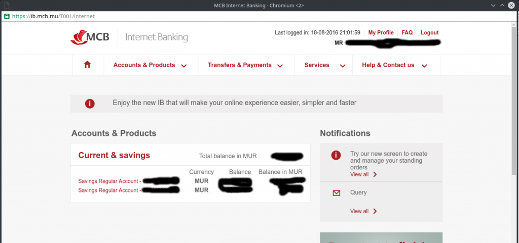
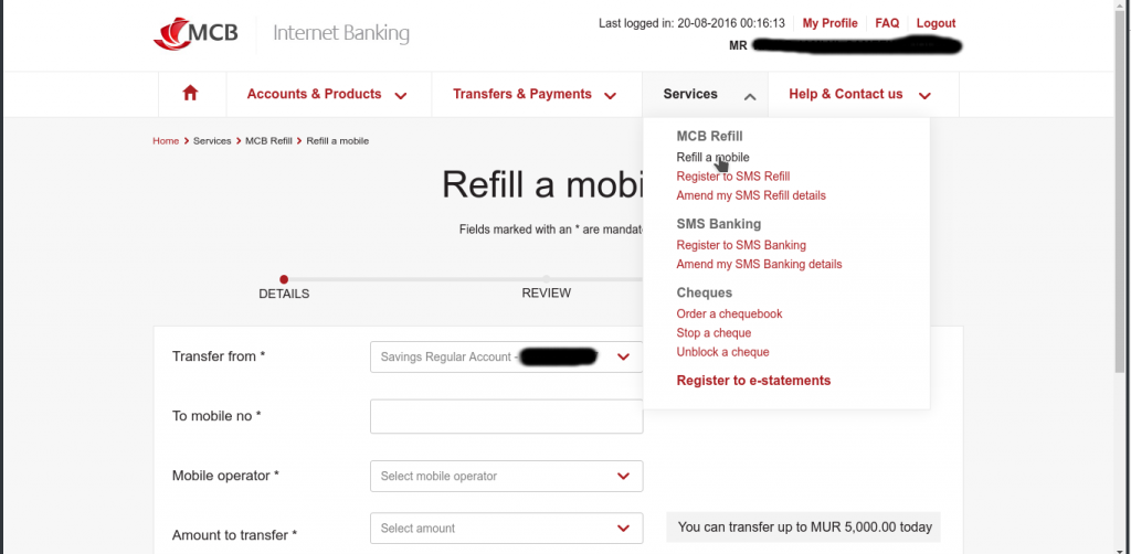
After logging in through the usual Internet Banking link, I was asked to choose a new password after which I was in the new web interface.

It definitely looks better than the previous interface which had a long long menu bar. It feels very light and minimalist.

However I am still facing a hard time accessing my Prepaid Card dashboard that is still dependent on flash; meaning it can’t be used on Macs and Linux unless you have flash plugin installed.
@mcbgroup Why can't i load this page? pic.twitter.com/0kM0lbTSM6
— Nayar (@NayarJoolfoo) May 4, 2016
How did you find the new internet banking portal? How is it compared to other internet banking in Mauritius like SBM or HSBC etc?