Who hasn’t heard of Big Data in the 21th century? Big Data in itself isn’t much of a great deal as knowing how to extract useful information from the data. It is the analytics part which is the killer feature of Big Data. It comprises of both science and art!

The first step of Big Data solutions is to gather data. There are lots of ways in which you can achieve this. Manual Data Entry can still be done but you’ll require quite an army of minions for that. But I was not “evil” enough to convince the minions to work for me. So I had to find other ways: Facebook Graph API allows you to get feeds from your wall, car groups you’re in.
{
“message”: “Renault Scenic
Rs138,000 – Vacoas, Plaines Wilhems, MauritiusFor sale Renault Scenic Year 2005,STEPTRONIC gearbox,fully executive,1500 cc Petrol,never accidented,comes with digital dashboard,armrest,electric mirrors,alloy wheels and panoramic sunroof”,
“updated_time”: “2017-04-16T05:57:29+0000”,
“id”: “14851777“},
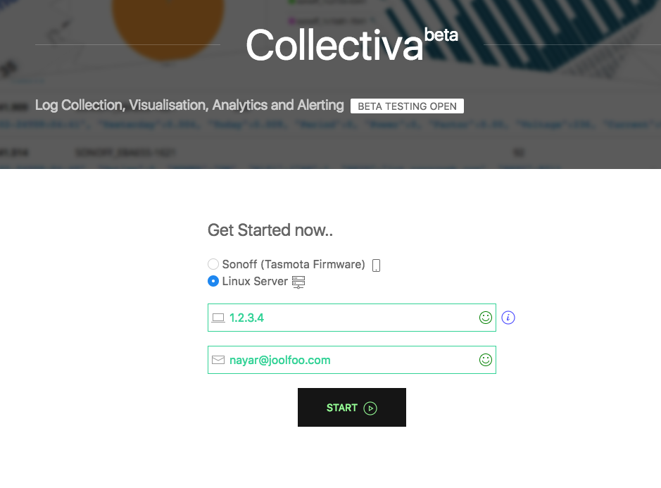
Good news is that the data is in JSON format. Bad news is that the message field contains unstructured data. We have to extract the informations we want from it. I use Collectiva Beta service (from nayarweb.com) for data processing.
Let’s extract the Make, Model, Price, Location and Year from the data. I use grok patterns on the message field.
Make and Model: ^%{NOTSPACE:make} %{NOTSPACE:model}
Year: (y(ea)*r|an(n*e*))\s*\:*\s*(?<year;int>[0-9]+) // works with an 96, year 2003, yr : 14, anne 2000
Price & Location: (((Rs|\$|£|₹)(?<price_string>([0-9,])*))|FREE)( – %{GREEDYDATA:location_string})?
Now we can just throw data at it. Some will get properly parsed, some not. But with enough data, you can still get some pretty graphs. In the future, hopefully I get an AI do the extracting for me.
Let’s get to the pretty parts now: graphs.
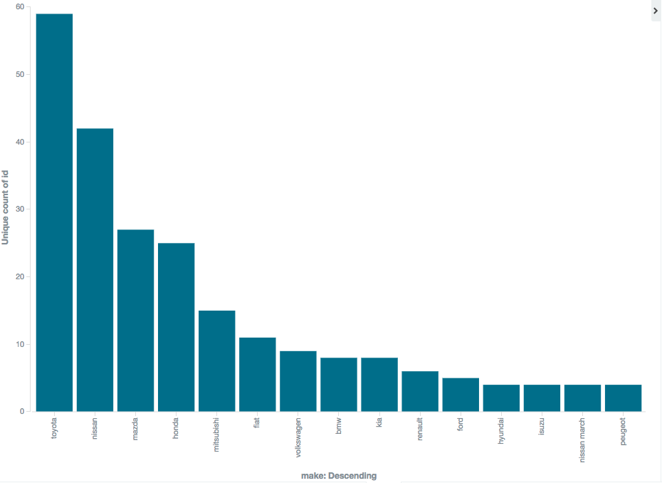
Which car makes are the most sold in Mauritius?
Easy: A Bar Chart
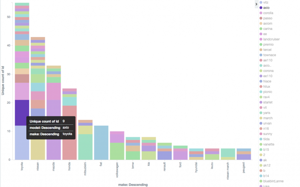
How many models are within each make?
No need to have another graph. We just split the split bars for models. Voila!
How much do the car models depreciate in Mauritius?
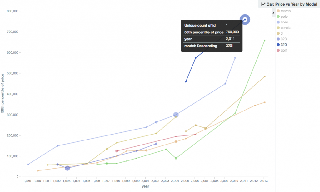
Notice that it is graphing the 50th percentile which is also known as median. Means are kinda useless because a single outlier can cause the graphs to be very skewed by a lot. We can show the 10th, 50th, 90th percentile on the same graph so that you can compare whether the car you’re buying falls between the accepted market price. Let’s say you want a Volkswagen Polo
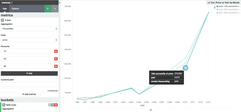
You can see the same lines above are not split into 3 lines. I don’t have much variation here because I’ve been collecting data for only 4 days. The lines are supposed to smoothen over time and the accuracy will increase.
Wanna see the Big Picture? Welcome the Pi Chart
In this graph, I aggregated the data into Make, Model, Year and Price. All in 1 graph. It’s like magic nah?
Want to get into Big Data World?
If you have big databases sitting around, like for supermarket, warehouse, manufacturing and agriculture, or you run an SME or NGO and would like to benefit from the insights of Big Data tools feel free to contact me for a quotation.