Paradigm shifts are very small in KDE as compared to what gnome and other workspaces offer in their upgrades. This might make following KDE upgrade kinda boring or unexciting. KDE’s look the same since maybe decades. This is one of the reasons people prefer KDE 😉
The desktop
After a fresh install. Here’s what you see. Nothing.
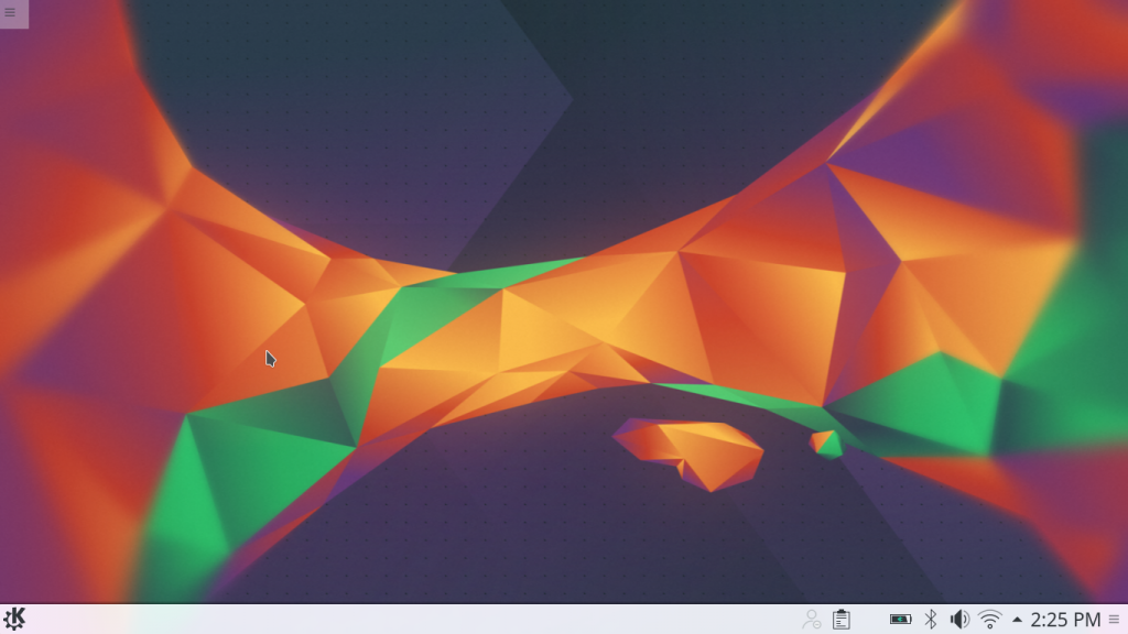
Look at how ugly the KDE Cashew button has become. It used to be so beautiful in previous releases.
![]()
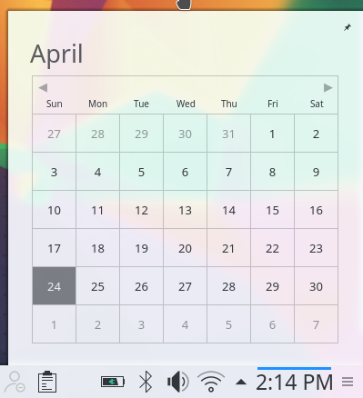
No more events and holidays shown in Calendar Widget :(. Maybe the feature might come in the future.
Start menu
Pressing the “start” icon. Nothing. I’d expect at least a browser and file manager there. How would people coming from Microsoft Windows get a hint where to start exploring?
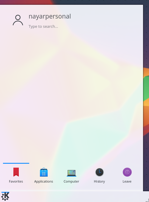
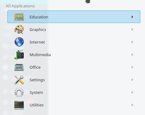
What? The icons are still like KDE 4 era?
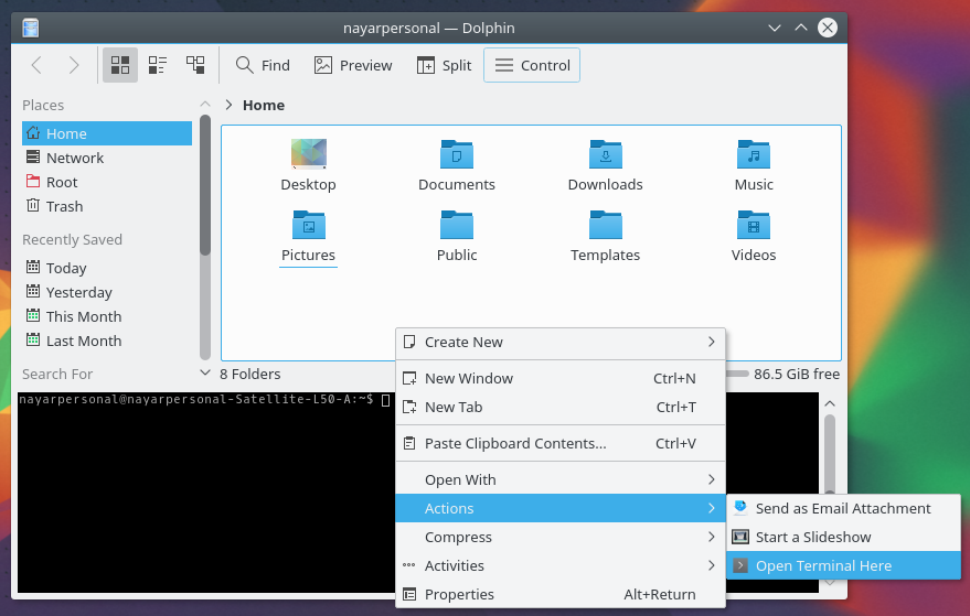
Dolphin
No visible regressions nor visible improvements.
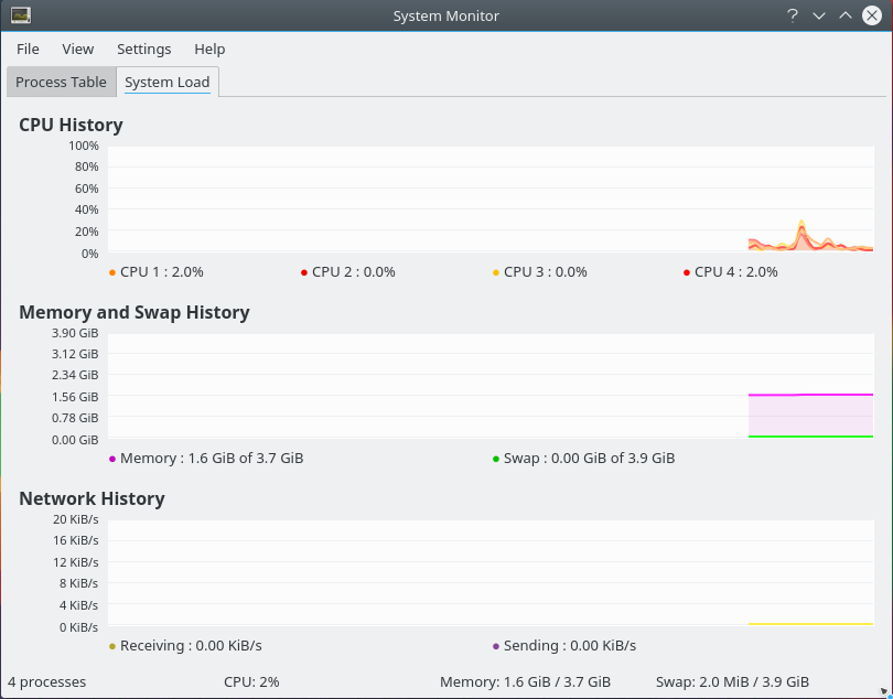
System Monitor
Same
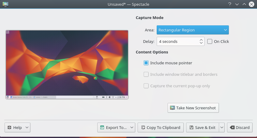
New Screenshot App: Spectacle
Well. Like the previous app except that now it names the screenies with the time in the filename (‘Screenshot_20160424_141321.png’). Nice
Kontact
Never worked 100% with me. In KDE 4, I couldn’t rely on it to bring me my mails and alert me. It would just stop working for no apparent reason and work again later. First time opening Kontact in Kubuntu 16.04. It looks like this:
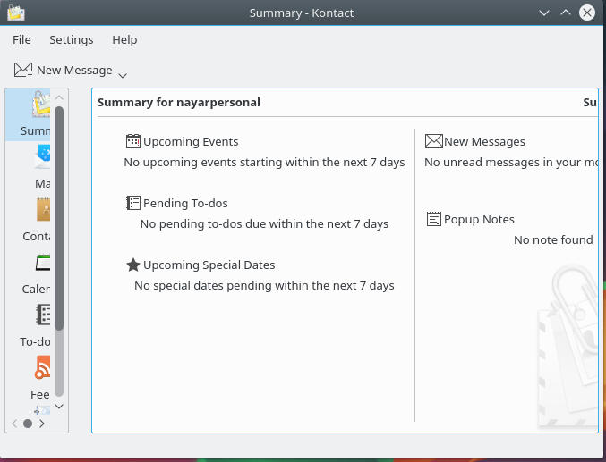
Don’t think it is production ready. Will it ever be? I guess no one uses it. I’ll still test it in a few days at work.
Other issues:
I don’t seem to be able to drag and drop images from Dolphin or Spectacle to WordPress. Is it just me?
Conclusion:
It is just like KDE 4. Feels like KDE 4. Just maybe feels better (for now) with a refined “new” old look. Good to know that it is running with Qt5 with QML.
If your production Kubuntu 14.04 LTS works well for you, I don’t really see the need to go through the pain of upgrading knowing that the upgrade process *might* break. If you are installing Kubuntu on a new machine, definitely choose 16.04 LTS. Better stay up-to-date on paper 😉